Last Updated on August 22, 2022 at 11:19 pm
Here are some charts from yesterday’s post: Should gold be part of your long-term investment portfolio?
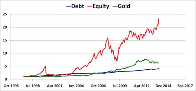
- Franklin Indian Blue Chip is chosen as representative of equity
- Franklin Indian Income fund as representative as debt.
- Per gram price data obtained from indexmudi is used to represent gold investment
- Data range is June 1997 to June 2014 (quite small but not bad).
- Results over a longer period can be found here: gold is riskier than stocks
Normalized NAV movement (absolute)
Normalized NAV movement (logarithmic)

🔥Secure your future with our Robo-advisory tool trusted by over 3,500 investors and advisors. From effortless retirement planning to funding your children’s biggest dreams, turn your financial goals into reality. 🔥
Subscribe for money management solutions via email! (Link takes you to our email sign-up form) Join 32,000+ readers in our community.
👉 New Tool Alert! NaviPlan: A Privacy-Focused Multi-asset Tracker and Goal Planner 👈
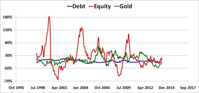
Rolling annual returns (all three)
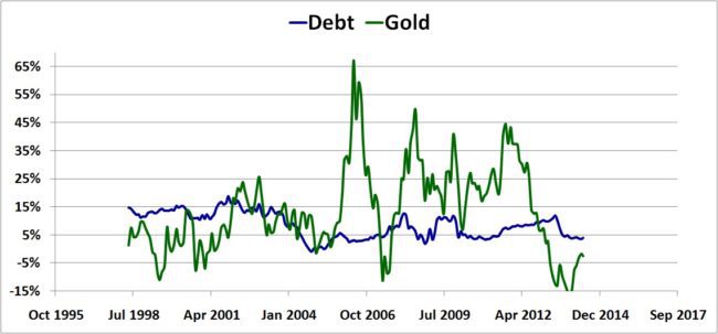
Rolling annual returns (debt and gold)
Extent of Correlation
The extent of correlation between annual prices returns can be easily computed with Excel. If there are two asset classes in a portfolio, ideally they must be negatively correlated. That is if one gives +ve returns, the other gives -ve returns and vice versa. This will stabilize the portfolio regardless of market conditions.
Gold and Equity annual returns are correlated by -0.65%. Negative, but too small to make a difference, in my opinion.
Debt and Equity: -3%. Better but not spectacular. The stability that debt offers in a folio makes it indispensable.
Debt and Gold: -21%. Now that is significant, but not very useful!