Last Updated on September 4, 2018 at 9:59 am
Here is a simple Excel sheet to keep track of monthly SIPs. Unlike the automated mutual fund tracker, where the focus is on returns, this sheet helps to visually track the growth of a SIP relative to an expected growth.
The user will have to enter the value of SIP each month to track its evolution. The inputs required can be seen in the screenshot (click for a better view).
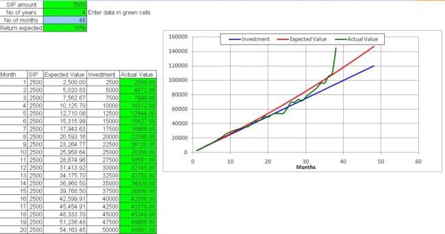
The sheet can be used by investors new to mutual funds to understand and get used to volatility.
🔥Secure your future with our Robo-advisory tool trusted by over 3,500 investors and advisors. From effortless retirement planning to funding your children’s biggest dreams, turn your financial goals into reality. 🔥
Subscribe for money management solutions via email! (Link takes you to our email sign-up form) Join 32,000+ readers in our community.
👉 New Tool Alert! NaviPlan: A Privacy-Focused Multi-asset Tracker and Goal Planner 👈
At any point of time, the graph tells us how far ahead or behind the fund is with respect to our expectation. Even though such a graph can be auto-generated with the automated mutual fund tracker, I think it can be an enjoyable experience to manually track the SIP by entering the fund value once a month.
If the entire equity and debt portfolios can be plotted in a similar fashion, it would aid rebalancing and analysing progress. The present sheet is the first step in that direction.
Download the visual SIP tracker