Last Updated on June 22, 2023 at 10:28 am
A reader asks after looking at the Sensex chart in the article – Do not stop or redeem your equity investments! Now is the best time to invest! (also shown below), “Why did you draw the Sensex chart in logarithmic scale? What is the benefit of doing so?”
Let us start with what a logarithm is. We all know what “to the power of” means. That is 10 to the power of 2 = 10^2 = 10 x 10 = 100. This is also known as exponentiation. The logarithm is the opposite of exponentiation.
Think of these maths operations as some bread toaster. You put in the number 10, press 2, enter the “power of” button, and out pops 100. Now imagine doing the reverse. You push in 100 and enter the “logarithm of” button, and out pops 2. Let us see how this is useful.
Suppose I have the numbers 10, 100, 1000, 10000, and 100000. The difference between adjacent numbers keeps increasing more and more. If we plot this in a normal graph, it would look like this.
🔥Secure your future with our Robo-advisory tool trusted by over 3,500 investors and advisors. From effortless retirement planning to funding your children’s biggest dreams, turn your financial goals into reality. 🔥
Subscribe for money management solutions via email! (Link takes you to our email sign-up form) Join 32,000+ readers in our community.
👉 New Tool Alert! NaviPlan: A Privacy-Focused Multi-asset Tracker and Goal Planner 👈
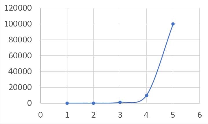
Notice that because the span of numbers goes from 10 to 100000, the variation in the last few numbers completely masks the variation in the first few numbers. The log chart lets us view all the numbers on the same scale.
Notice that 100 is ten times more than 10. 1000 is ten times more than 100 and so. A property of the logarithm allows us to view this scaling immediately.
Log (A/B) = Log (A) – Log (B)
Now, we have,
Log(10) = 1
Log(100)= 2
Log(1000= 3
Log(10000)= 4
Log(100000)= 5
So Log(100/10) = Log (100)- Log (10) = 2-1 = 1.
The difference between adjacent numbers in log is the same (for this set of numbers) = 1. So the plot in the log scale will look like this.
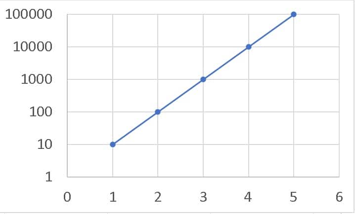
Now the variations in both the big and small numbers can be seen, and the spacing between 10 and 100 is the same as the spacing between 1000 and 100. This is not possible on a normal scale. Now let us see this in action.
This is the Sensex price movement from April 1973 to March 2023.
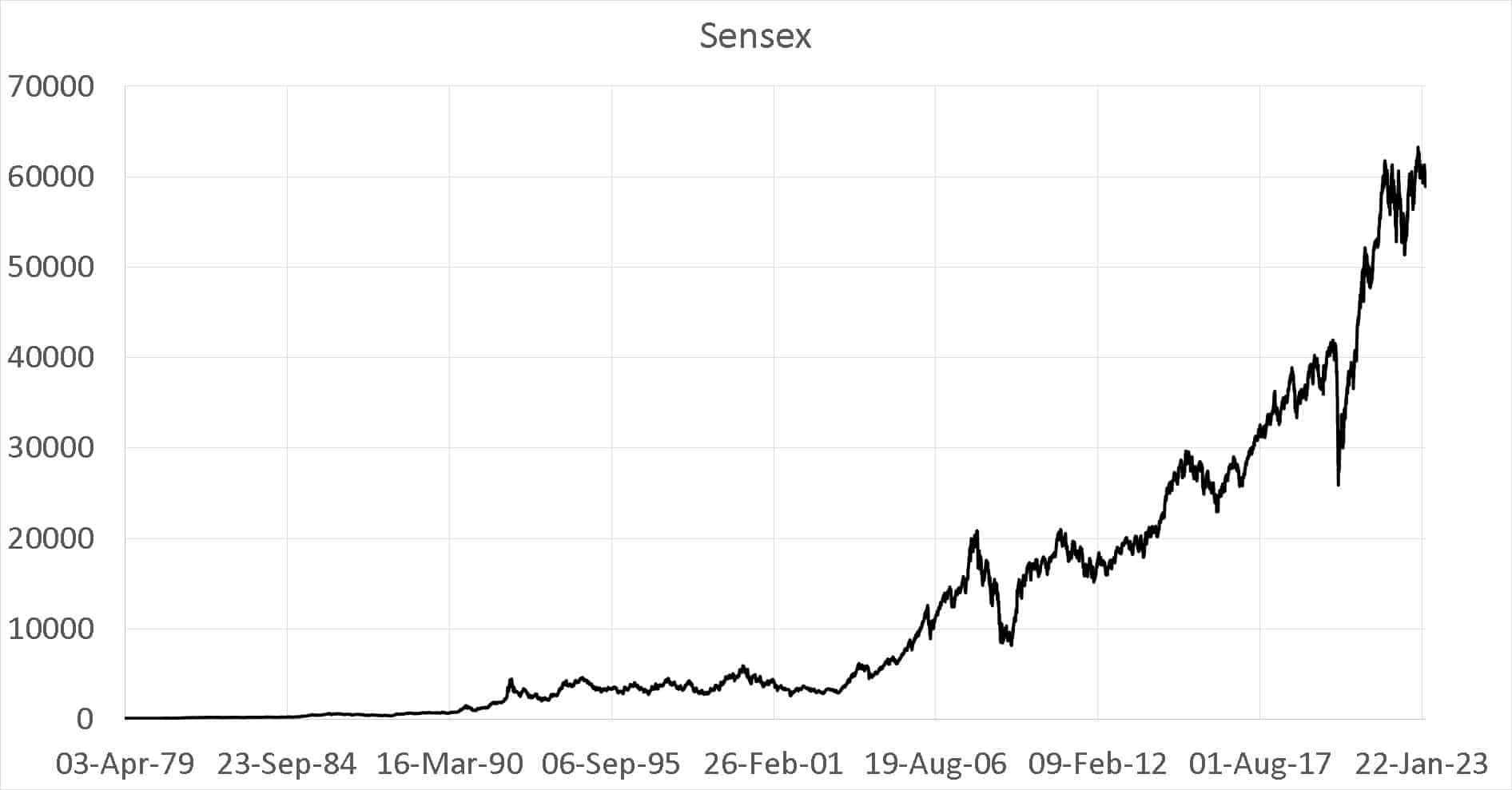
The movement in the 1970s,80s and 90s are completely masked by the movement thereafter. The Sensex in log scale (with sideways markets shown in red) looks completely different.
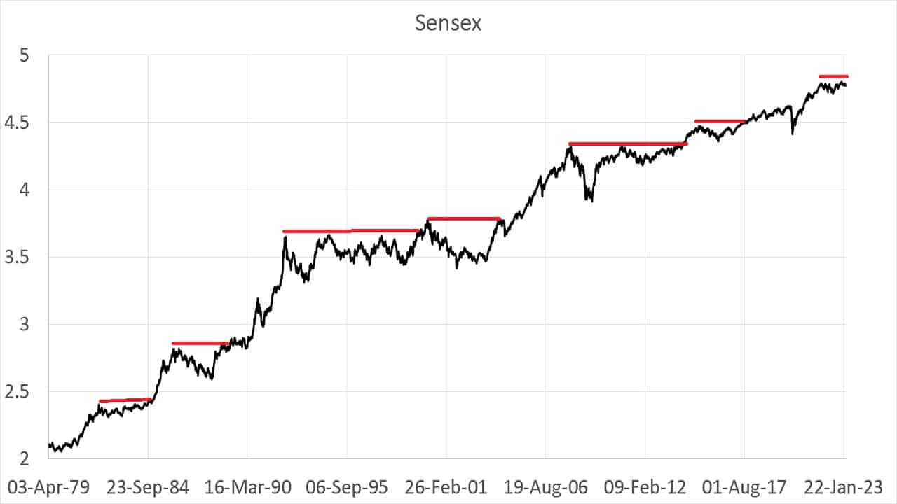
The features in the early days of the Sensex are clearly seen and more important, we can compare changes across decades. A 0.5 log scale movement in the 1980s is identical to the same quantum leap anytime after.
Here is an extract from our previous article – Are you ready to climb the Sensex Staircase?!
In order to get a sense of the features, I have added several indicators (drawn with the full benefit of hindsight – only for illustration).
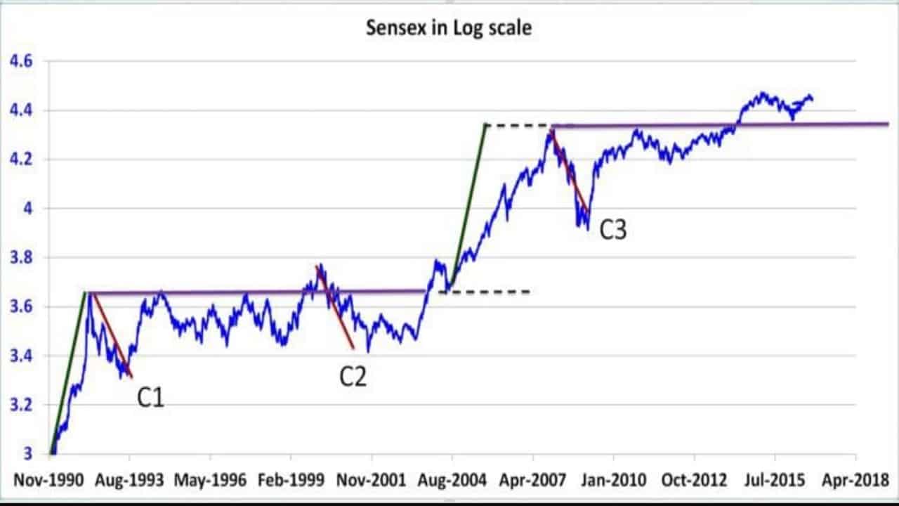
The Green lines First, let us look at the green line at the bottom left of the picture. It represents the bubble before the Harshad Mehta scam. For a good read on such market bubbles, see Review: Riding The Roller Coaster -Lessons from financial market cycles we repeatedly forget.
The increase in Sensex value over the course of this green took only one year! A leap from 3 to 3.6 (log) ~ 0.6(a little more).
Look at the second green line between the two dotted horizontal lines. This is the great bull in the 2000s. This increase is identical in magnitude to the Harshad Mehta bubble, except that it occurred over 3+ years. This is a simple illustration of the power of the log chart.
The Red lines, as you may have guessed, represent crashes. The Harshd Mehta scandal, the dot-com bust and the 2008 crash are similar in magnitude. A fact that the plain chart (top graph) cannot reveal.
The violet lines represent sideways markets. The first one lasted more than a decade. The second line is a projection in time.
The staircase pattern should be obvious now. Every big upward movement (so far) has resulted in a prolonged sideways market that would last for years. A fact that new equity investors should be aware of. This is why we must ask ourselves, am I ready to climb the Sensex Staircase?!
This is a log chart of the NASDAQ 100 Total Return in INR. See: What return can I expect from a 10-year SIP in the Nasdaq 100?
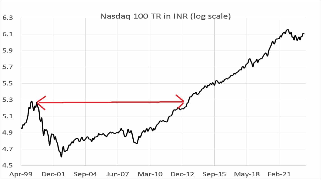
The area under the red arrow is about 15 years during the index was “underwater”. The log scale allows us to visualize this clearly and puts into perspective the recent fall compared to that during the dot-com crisis.