Last Updated on December 18, 2021 at 10:54 pm
It can be extremely educative when the Sensex chart is plotted such that past bull and bears runs can be compared to more recent such movements. This can be easily accomplished by plotting the Sensex closing value as a logarithm. This reveals a fascinating staircase pattern that is discussed in this post.
A log chart is also known as an equal interval chart and gives a better visual representation of rises and fall.
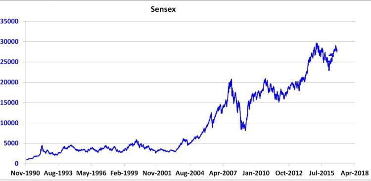
Normal Sensex Chart
Here is the normal Sensex chart.
🔥Secure your future with our Robo-advisory tool trusted by over 3,500 investors and advisors. From effortless retirement planning to funding your children’s biggest dreams, turn your financial goals into reality. 🔥
Subscribe for money management solutions via email! (Link takes you to our email sign-up form) Join 32,000+ readers in our community.
👉 New Tool Alert! NaviPlan: A Privacy-Focused Multi-asset Tracker and Goal Planner 👈
The most striking feature of this chart is the 2008 crash and the bull run that preceded it. Details of past market movements are not quite visible.
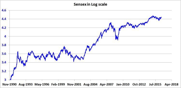
Sensex Log Chart (plain)
This is the Log (base =10) chart of the Sensex. Notice how past features have now not only become prominent but are also on the same scale as that of newer features.
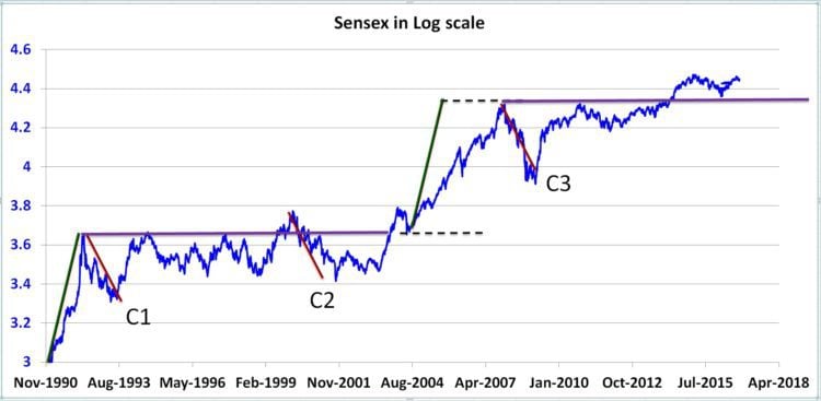
Sensex Log Chart (annotated)
In orde to get a sense of the features, I had added several indicators (drawn with the full benefit of hindsight – only for illustration) .

The Green lines First let us look at the green line at the bottom left of the picture. It represents the bubble before the Harshad Mehta scam. For a good read on such market bubbles, see Review: Riding The Roller Coaster -Lessons from financial market cycles we repeatedly forget
The increase in Sensex value over the course of this green took only year! A leap from 3 to 3.6 (log) ~ 0.6(a little more).
Now look at the second green line between the two dotted horizontal lines. This is great bull in the 2000s. This increase is identical in magnitude to the Harshad Mehta bubble. Except that it occurred over 3+ years. This is a simple illustration of the power of the log chart.
The Red lines The red lines, as you may have guessed, represent crashes. The Harshd Mehta scandal, the dot-com bust and the 2008 crash are also very similar in magnitude. A fact that the plain chart (top graph) cannot reveal.
The violet lines They represent sideways markets. The first one last more than a decade. The second line is a projection in time.
Have we recovered from the 2008 crash? If we look at the plain chart, our answer could be yes! In log scale, the recovery (if any) is only marginal.
The staircase pattern should be obvious now. Every big upward movement (so far) has resulted in a prolonged sideways market that would last for years. A fact that new equity investors should be aware of.
Which is why we all need to ask ourselves, am I ready to climb the Sensex Staircase?!