Last Updated on January 2, 2016 at 5:59 pm
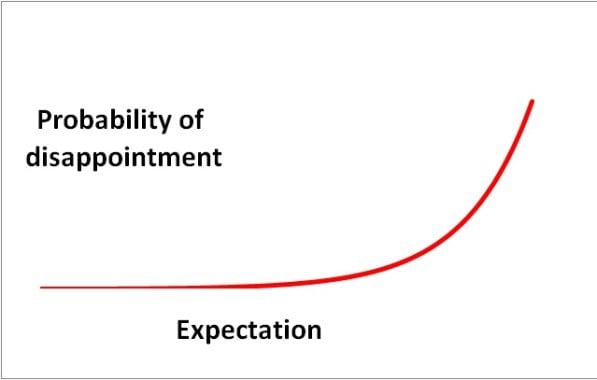
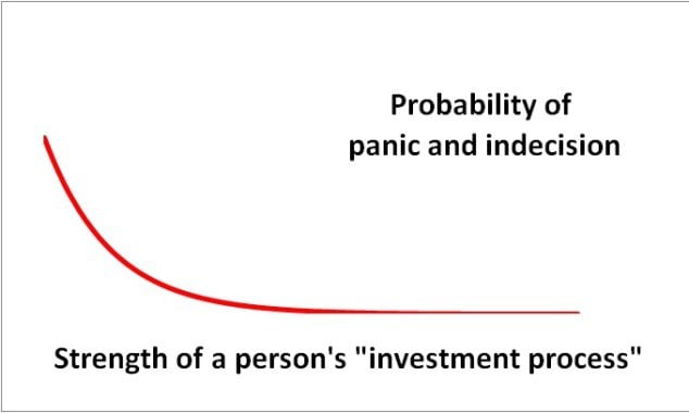
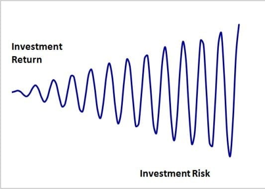
I am a fan of Carl Richard’s (Behaviour Gap) napkin drawings (who is not?!). From time to time, I have thought of similar sketches but never got around to actually drawing them on my own napkin – Excel. Here are few.
The whole point of such a sketch is that it should be self-explanatory. So I am not going to add much commentary. Do let me know what you think.
🔥Secure your future with our Robo-advisory tool trusted by over 3,500 investors and advisors. From effortless retirement planning to funding your children’s biggest dreams, turn your financial goals into reality. 🔥
Subscribe for money management solutions via email! (Link takes you to our email sign-up form) Join 32,000+ readers in our community.
👉 New Tool Alert! NaviPlan: A Privacy-Focused Multi-asset Tracker and Goal Planner 👈
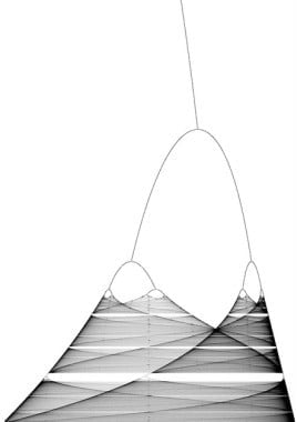
This is how the stock market actually behaves!
Note: This is referred to as a bifurcation map and has a one-to-one correspondence to a something known as a Mandelbrot set.
This is how the financial system models the stock market!

“Empirical Rule” by Dan Kernler – Own work. Licensed under CC BY-SA 4.0 via Commons.