Last Updated on January 2, 2016 at 5:45 pm
What we know as Systematic Investment Plan is an investment strategy (not a financial product!) derived from what is known in the US as Dollar Cost Averaging. Obviously the term SIP sells better(than Rupee cost averaging) !
The Indian stock market is a toddler. Sensex data is available from only 1979. Many have argued with me that stock markets should be analyzed only after liberalization- that is from the early 90’s. So that would make the market an infant, arguably a premature one at that!
The reason for saying that is, the conclusions that one usually makes like, “sell when Nifty PE is >23” etc. are all based on this short history that we have and hence unreliable. It is only when we look at market data over tens of decades, can we understand how it works and how little we understand it. Mandelbrot used over150 years of cotton prices to show to the world that the assumption of normal distribution is wrong.
What if we took S&P 500, the US broad market index, for which data is available from 1871 and studied long term SIP returns on rolling basis (explained below)?
🔥Secure your future with our Robo-advisory tool trusted by over 3,500 investors and advisors. From effortless retirement planning to funding your children’s biggest dreams, turn your financial goals into reality. 🔥
Subscribe for money management solutions via email! (Link takes you to our email sign-up form) Join 32,000+ readers in our community.
👉 New Tool Alert! NaviPlan: A Privacy-Focused Multi-asset Tracker and Goal Planner 👈
That market has seen two world wars, recessions, terrorist attacks, assassinations, scandals to name just a few. How much has the SIP (DCA) returns varied over say, 15 year periods?
The following was done to answer that question.
Monthly S&P price data, along with inflation index, and 10 year Gov bond rates are available from 1871 here
http://data.okfn.org/data/core/s-and-p-500
Unfortunately, Excel will recognize dates only 1st Jan 1900. So we work with that.
Jan 1900 to Jan 1915 represents the first 15 year SIP period for which return (XIRR) is calculated.
Feb 1900 to Feb 1915 is the second period. We have now rolled over the investment duration.
We roll over until May 2015 is the end date of the last 15-year period.
There are now 1025 such 15-year periods from Jan 1900 to May 2015.
Rolling SIP returns (automated version coming soon) can easily be calculated with a simple Excel macro in about 45 seconds. Then we stare at the graphs in search for wisdom.
Click on the graphs if you wish to see a clearer image.
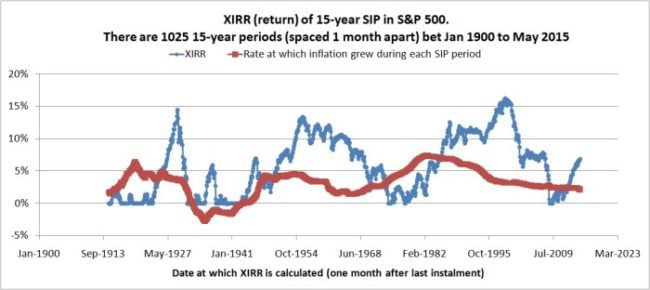
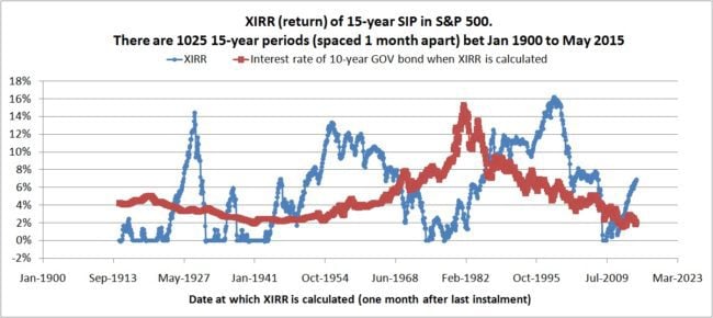
The SIP returns are the same in the top and bottom graphs. The top graph has the inflation rate for the corresponding investment period. The bottom graph has the 10-year bond interest at the end of the SIP period.
Each blue point is a 15 year SIP return. Notice many of then are zero. This means, that there is a loss. Expenses have been neglected!
Notice how strongly the return depends on when you start the SIP!!!
For several periods, the return is zero or below inflation. Inserted the 10Y interest rate data more for information. Don’t wish to conclude anything with it.
Moral of the story: There is no guarantee that SIP will work for any number of years. Since when you start the SIP matters, active management is essential as the financial goal nears. People who recommend equity for short durations are selling products and/or have little knowledge about investment risk.
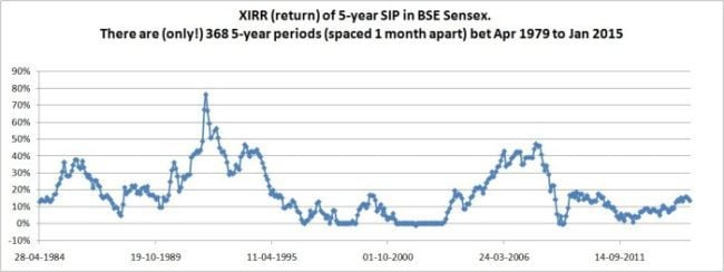
5-year rolling SIP returns
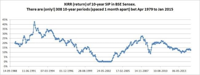
10-year rolling SIP returns
15-year rolling SIP returns
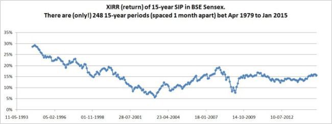
Notice the number of times the return has fallen below 10% (before taxes).
If you want guarantees that your SIP investments will ‘work’ or help you achieve your goals, you are barking up the wrong tree.