
Last Updated on August 31, 2022 at 4:53 pm
The yield curve is a plot of the current yields of bonds from the same type of issuer versus their respective maturities. Observing the bond yield curve is a way to determine what is going on with our economy. In this post, I discuss how one can do this with some examples.
First, let us look at the evolution of the RBI policy rate.
source: tradingeconomics.com
In the early 2000s, rates came down sharply as India came out of a debt crisis. Inflation was low, and the state was set for economic growth. The stock markets zoomed up until the 2008 crisis. The crisis triggered a rate cut to handle liquidity. The subsequent recovery and high inflation resulted in rate hike and it has been reduced in stages only the recent past.
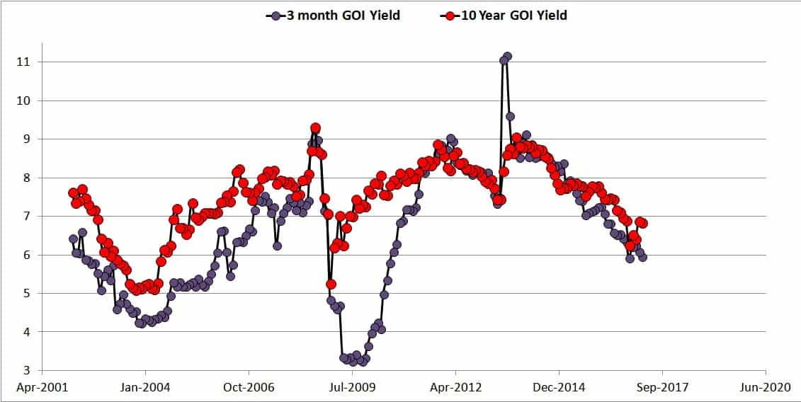
These changes are reflected directly in the short-term bond yields and indirectly in the long-term bond yields as shown below.
🔥Secure your future with our Robo-advisory tool trusted by over 3,500 investors and advisors. From effortless retirement planning to funding your children’s biggest dreams, turn your financial goals into reality. 🔥
Subscribe for money management solutions via email! (Link takes you to our email sign-up form) Join 32,000+ readers in our community.
👉 New Tool Alert! NaviPlan: A Privacy-Focused Multi-asset Tracker and Goal Planner 👈
Under normal circumstances, bonds with higher duration (from the same issuer) will have higher yields due to the inflation risk associated with the tenure than bonds with lower duration. And normal circumstances refers to increasing inflation due to economic growth. That is demand for goods (which is good) is higher than supply, resulting in inflation. This results in a normal yield curve.
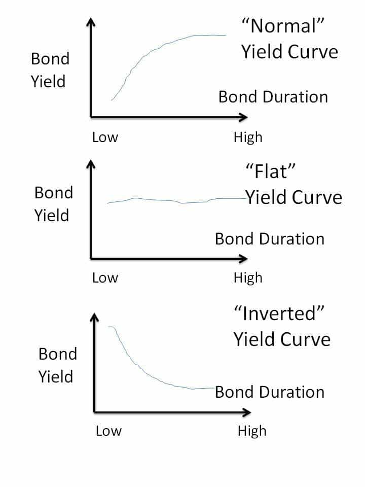
If the short-term and long-term bond yields are similar, this can indicate uncertainty of economic growth and inflation, resulting in a flat yield curve. We had this just after the 2008 crash.
In July 2013, RBI hiked the short-term interest rate to stem the purchase of short-term bonds, reduce liquidity in the market and support the falling rupee. As a result, the short-term yields skyrocketed (see top graph) and produced an inverted yield curve.
The video below (no audio, safe for work) shows the change in the yield curve from
Jan 2013 (flat ) –> July 2013 (inverted, bond crash) –> Dec 2013 (flat and wavy) –> June 2015 (tending to normal after rate cuts) since then.
So we have gone from a flat yield curve (recession) –> inverted yield curve (weak rupee and uncertainty) –> flat –> tending towards normal.
This is a sign of weakening inflation and rate cuts. We now have a stable government for at least until 2019. The only thing missing is real corporate earnings. If that shows up, the real party begins. 🙂
in.investing.com offers a simple way to observe current and past yield curves.
Head to https://in.investing.com/rates-bonds/india-government-bonds?maturity_from=10&maturity_to=290