Last Updated on April 26, 2025 at 9:27 pm
While discussing the distribution of wealth in India, I had referred to the idea of self-similarity with the example of the Pareto principle. Today I would like to discuss how the stock market behaves in a similar way!
The first part of this series is here: Fat Tails: The True Nature of Stock Market Returns – Part 1
To recap, we say that 20% of the population hold 80% wealth. If we zoom in on the 20%, then: 20% of 20% population hold 80% of 80% wealth.
If we zoom in on the 20%, then: 20% of 20% (4%) population hold 80% of 80% wealth (64%)
🔥Secure your future with our Robo-advisory tool trusted by over 3,500 investors and advisors. From effortless retirement planning to funding your children’s biggest dreams, turn your financial goals into reality. 🔥
Subscribe for money management solutions via email! (Link takes you to our email sign-up form) Join 32,000+ readers in our community.
👉 New Tool Alert! NaviPlan: A Privacy-Focused Multi-asset Tracker and Goal Planner 👈
If we zoom in on the 4%, then: 20% of 4% (or 20% of 20% of 20%) or 0.8% of the population hold 80% of 64% (or 80% of 80% of 80%) or 51% wealth.
So
20% holds 80% –> 4% holds 64% –> 0.8% –> 51% –>
Each segment obeys the Pareto principle. The segments make up a whole and the whole also obeys the Pareto principle.
Wealth distribution is self similar!
This is known as self-similarity or fractal behaviour: parts of a whole behave like the whole. Parts of the parts behave like the parts and also behave like the whole.
Reade more about this: The 80/20 rule: Making sense of richest 1% Indians owning 58% wealth!
I had mentioned that nature is fractal in nature. Before we head to the stock market, another fascinating example.
The Coastline Paradox
Suppose you wanted to measure the length of the coastline of a country (say Britan – because this problem originated there).
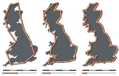
The answer you get depends on the yardstick used. The answer is nice and small for a long stick. Use a smaller stick, then the distance is bigger! This is the paradox – the answer depends on your measuring stick.
The ups and downs of the coastline over a zoom level of say 100 Km x 100 Km is similar to the ups and downs over a tighter zoom of 10 Km x 10 Km. This, in turn, is similar to the features observed over 1 Km x 1 Km.
Coastlines are self-similar!
The small ups and downs that you see over one kilometre are reproduced over 10s and 100s of kilometres.
Now look at the coastline of Great Britan and see if you can spot the similarity with the stock market. The ups and downs of the coastline resemble stock price movements.
The ups and downs in price observed daily are similar to the ups and downs over a week, over a month and even over a year.
The stock market is self-similar!
What is similar to all three situations? Parts of a whole, behave like the whole. Parts of the parts, behave like the parts and also like the whole.
Snowflakes are self-similar!
More on this and other examples later.
Let us get back to what we were discussing yesterday – the S & P 500.
We had looked a return distribution like this.
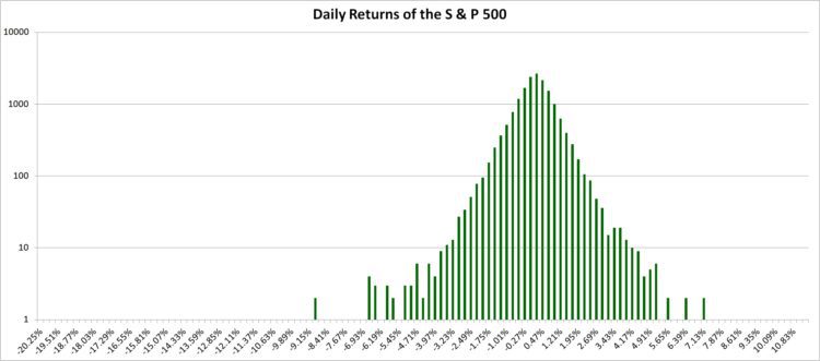
In his ground-breaking 1963 paper, Benoit Mandelbrot showed that cotton prices were self-similar. I will attempt a simplistic version of his research with the S & P 500.
The horizontal axis of the above graph represents return bins The vertical axis, the frequency with which daily returns occurred in each bin. Suppose I study the rate at which distribution falls off, this is what I get:
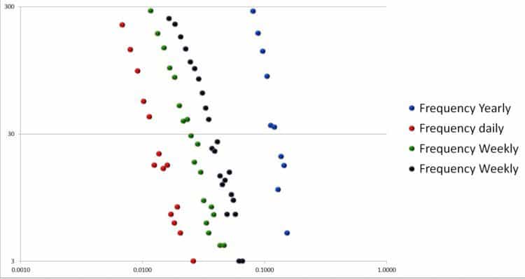
The horizontal axis represents return bins in log scale the vertical axis the frequency with which data falls in each bin (also in log scale).
Mandelbrot showed that rate at which daily returns fell, is similar to the rate which weekly returns fell and the rate at which monthly returns fell. (Yearly is a bit different).
This is the self-similarity. The movement over a day is similar to the movement over a week and over a month – just like a coastline under various zoom levels.
Note: Above data is only for outliers (not so frequent returns).
He went on to show that one can go on to construct a stock market-like behaviour over say months and years starting from a small variation (say over the course of a day).
Here is a picture from his famous Scientific Amercian article. The below image is a direct link from the article used under the fair use doctrine for commentary only.
This is a direct link to the Scientific American article mentioned above. No copyright infringement is intended. Clicking on the image will take you the scientific Amercian page.
Notice that the last panel represents stock market like behaviour and it has been generated from a simple construction like this: // (top panel).
Naturally, this will not exactly reproduce the market behaviour, but gives you an idea of how it behaves.
SO WHY SHOULD I BOTHER
Reason 1: This kind of self-similarity can account for extreme market events much better than a bell curve. So we get a better understanding of risk. More on this later.
Reason 2: Man has this desire to predict market movements. Using fractals may (repeat, may) get better results.
Traders are familiar with this behaviour via the Elliot Wave Theory. Arguably, T S Elliot (founder of Elliot waves ) knew about fractals decades before Mandelbrot did. The idea of self-similarity is common to both theories, but I need to dig deeper before I can comment on the efficacy of Elliot waves.
References
The (Mis)Behaviour of Markets: A fractal view of risk, ruin and reward by Benoit B Mandelbrot (available at Amazon.in)
The variation of certain speculative prices, The Journal of Business, Vol. 36, No. 4 (Oct 1963), pp. 394-419, by Benoit B Mandelbrot. Available here