Last Updated on December 29, 2021 at 6:03 pm
The Sensex closed for the first time above 50,000 on 3rd Feb 2021. We look at its 42-year journey for lessons on reward and risk.
The BSE provides closing price (excluding dividends) from 3rd April 1979 when the Sensex was 124.15. We shall use this data for analysis. Dividends will have to be added to all returns shown. This will typically be 1.5% to 2% extra return (before tax) occasionally falling to 1%.
Readers may recall this previous analysis with the same dataset: Sensex return is 16% plus over the last 41 years, but half of that came from just three good years! and Are you ready to climb the Sensex Staircase?!
First, we shall look at the Sensex move in log scale. Without the log scale, it is impossible to compare recement movements, for example, the 2020 crash with the 2008 crash or the Harshad Mehta scandal (see the Sensex staircase link for more explanation).
🔥Secure your future with our Robo-advisory tool trusted by over 3,500 investors and advisors. From effortless retirement planning to funding your children’s biggest dreams, turn your financial goals into reality. 🔥
Subscribe for money management solutions via email! (Link takes you to our email sign-up form) Join 32,000+ readers in our community.
👉 New Tool Alert! NaviPlan: A Privacy-Focused Multi-asset Tracker and Goal Planner 👈
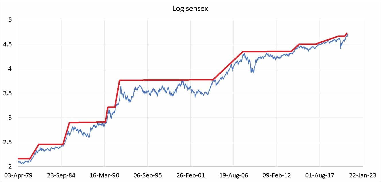
The red lines indicate bull runs and sideways markets (including crashes). Notice how the steps (bull runs) have gradually decreased in slope, meaning lower returns during bull runs.
The horizontal lines represent the duration for which the Sensex was “underwater” – lower than an all-time high. The longest such line was during the 90s – India’s own “lost decade” and then after 2009 recovery.
We had discussed an idea called “volatility bunching” before – large up-moves will be followed by large down-moves or vice versa. Small up-moves will be followed by small down-moves and vice-versa. Read more: Timing the market will work but not the way we imagined!
A gradual reduction in daily fluctuations can be seen if we plot the cumulative volatility of the Sensex. That is the standard deviation based on daily returns. Notice the gradually fall in volatility with intermittent jumps since the Harshad Mehta days.
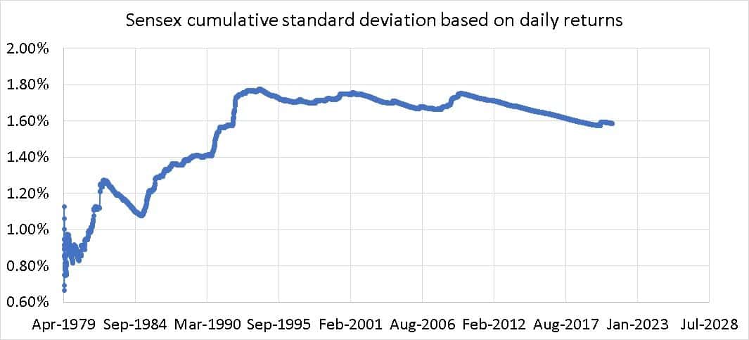
An investor with money in stocks since the 1980s would find the current volatility rather sedate or even insipid.
The same graph plotted for the S&P500 TRI since 1900 also paints a similar but smoother picture.
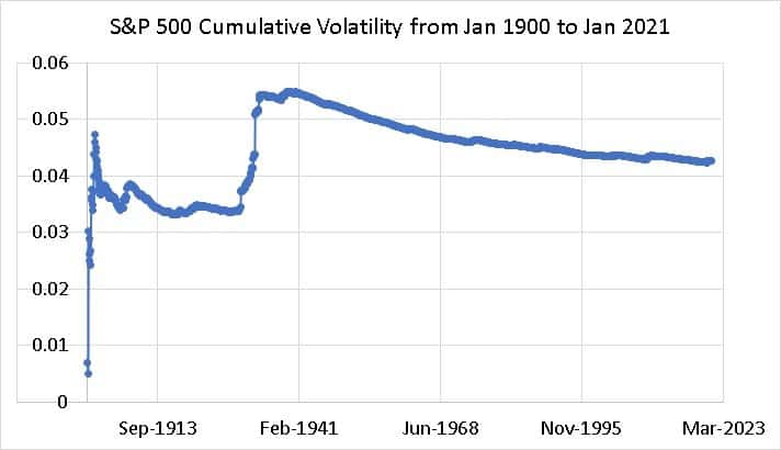
After the “great depression,” the cumulative volatility has been falling. Subsequent crashes look like minor blips!
Instead of the cumulative volatility, if we plot the rolling 10-year volatility, the result for S&P 500 TRI is astounding.
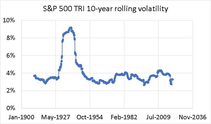
Over 10-year, the US market volatility has bee more or less the same except during the years of the great depression (the 1930’s). For the Sensex, this is how the 5-year rolling volatility looks like this (not enough history for 10-year data).
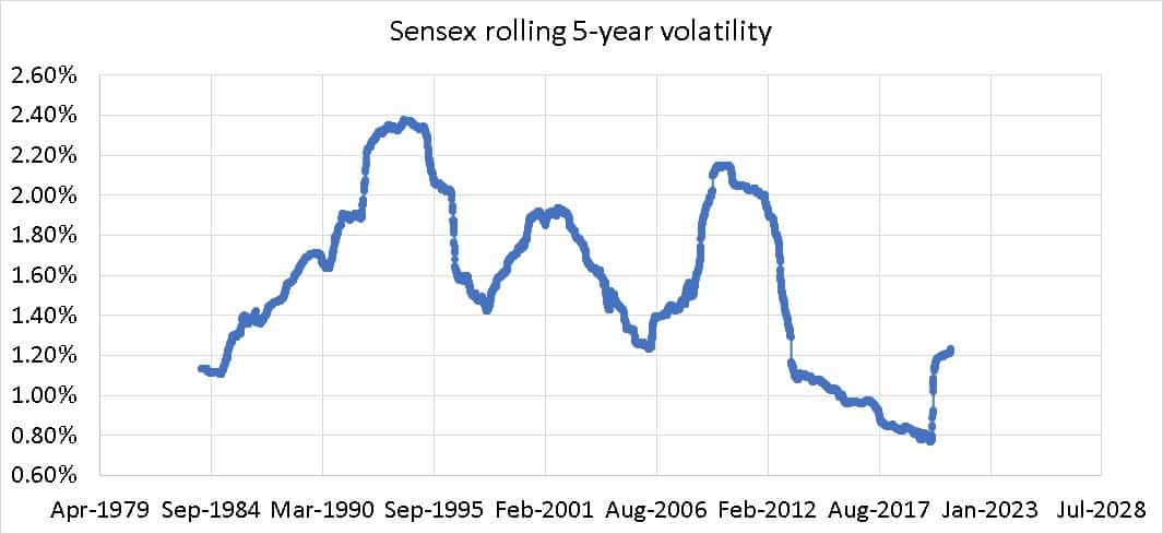
Still fairly high volatility and the 2020 crash is rather timid looking when compared to the Harshad Mehta scandal, the dot-com crisis and the 2008 crash! This despite the after biggest intraday, fall on 23rd March 2020! Conclusion: Indian market is relatively more volatile than the US market. If we take forex movement into account, the gap may widen. See the math here: Portfolio Diversification with International Stocks.
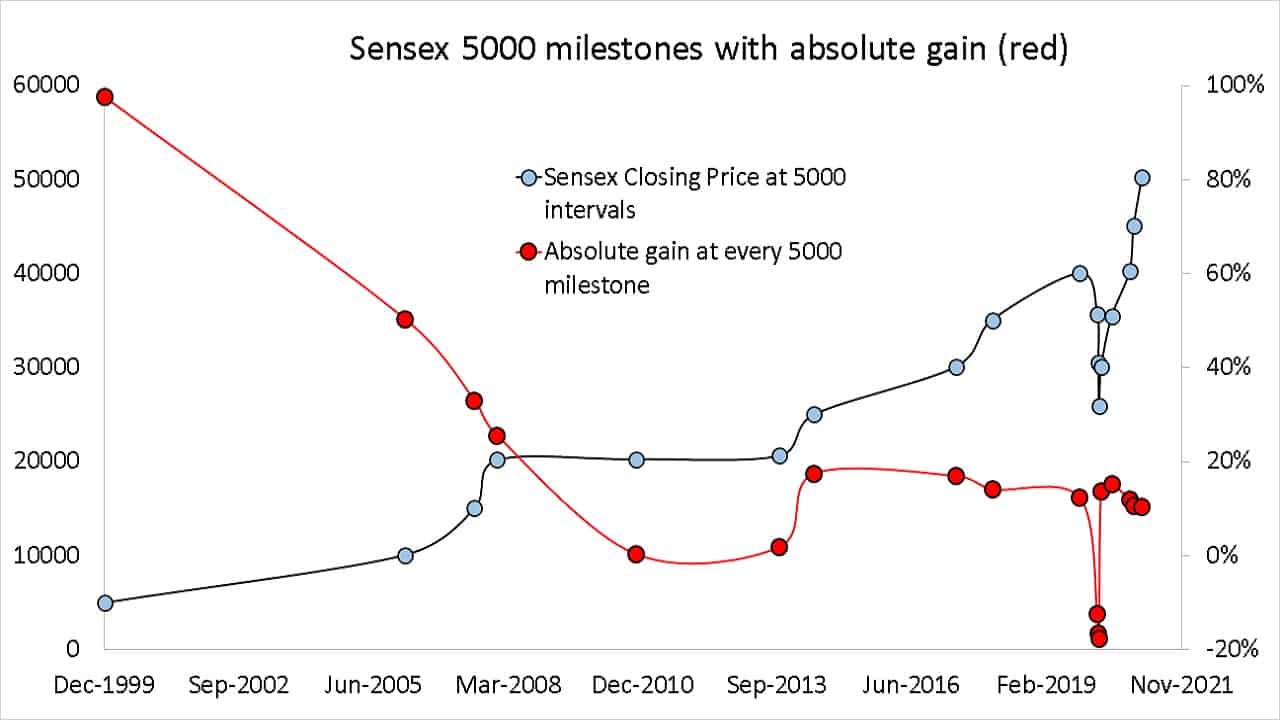
Shown below are the “5000 milestones” of the Sensex along with the absolute gain or loss from one milestone to another.
The table below shows the dates when the Sensex changed by 5000 points; the years and month it took for such change, the absolute gain or loss associated with this changed and the annualized return (CAGR) if the change took more than a year.
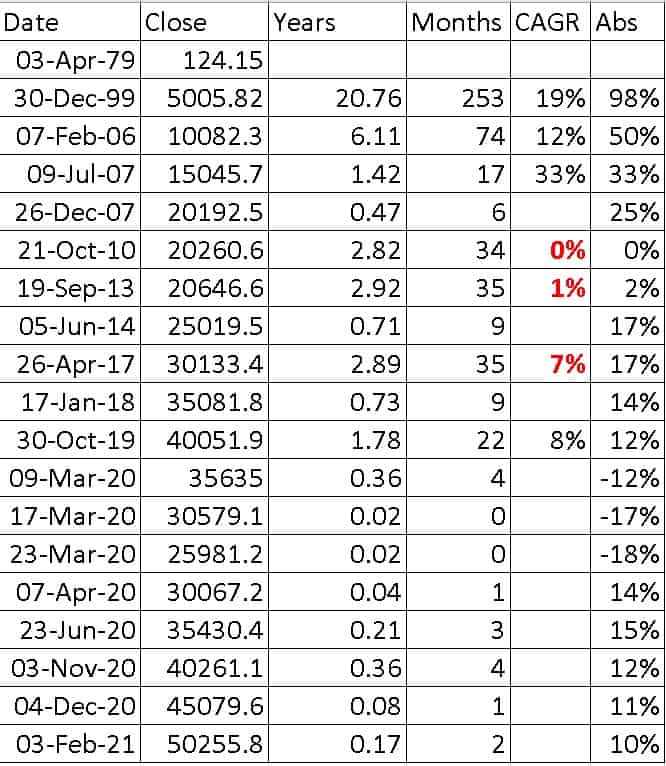
The recent frequent changes by 5000 points are hardly surprising because the baseline is higher. The first 5000 points increase obviously too the longest and since then it was the modern era of the Sensex (from the 2000s).
Even just a few years ago, we saw 5000 point gains taking 22 months and 35 months. Notice how the absolute gains do not reveal the true picture. They also tend to looky rosy such a movement. The annualised returns (excl dividend) highlights the importance of time. The longer it takes for the 5000 point move, the lower the annualised return—the money value of time at work.
You might have seen representations pointing to the “Indian growth story”:
The first 20 years, Sensex gained 5000 points and in the next 20 years, 45,0000 points. Three of the biggest 5000 point increases was see in the last few months etc.
This seems like a great growth story but if we consider the absolute gains for every 5000 point gain it reads 98%, 50%, 33%, 25%, 19%, 17%, 14%, 12%, 11%, 10%. So a 5000 point change in the Sensex is pretty much the norm and nothing to get excited about.
The only meaningful takeaway is the uncertainty associated with this 5000 point movement (up or down). Sometimes it takes less than a month and sometimes years. Volatility bunching will ensure gains or losses evaporate soon. It is the delay (range-bound markets) that will hurt investors the most because there is no such thing as “notional time loss”.