Last Updated on May 11, 2024 at 6:55 pm
A risk and return comparison of Gold (INR, per gram) and Sensex data over the last 40 years reveals that gold is a high-risk, low-reward investment! This is an updated gold vs equity study, much more comprehensive than previous reports. It is important for investors to understand these results especially when gold returns look promising during periods when equity is down.
In May 2014, a gold vs equity study using data up to 1925 showed that gold was riskier than stocks! The present study uses data from Jan 1979. Before we consider the results, it is important to recognise that the Gold price in INR is linked to not only Gold price in USD but also the exchange rate. In the past, this has resulted in quite different Gold INR and Gold USD movements: Gold Price Movement: USD vs INR
Readers interested in a deep-dive analysis of Sensex data can also refer Sensex Charts 35 year returns analysis: stock market returns vs risk distribution. In what follows we shall consider Sensex price data as a proxy for equity. Due to dividends, the returns shown will have to be enhanced by 1.5% to 2%. No expense fee or tax is considered.
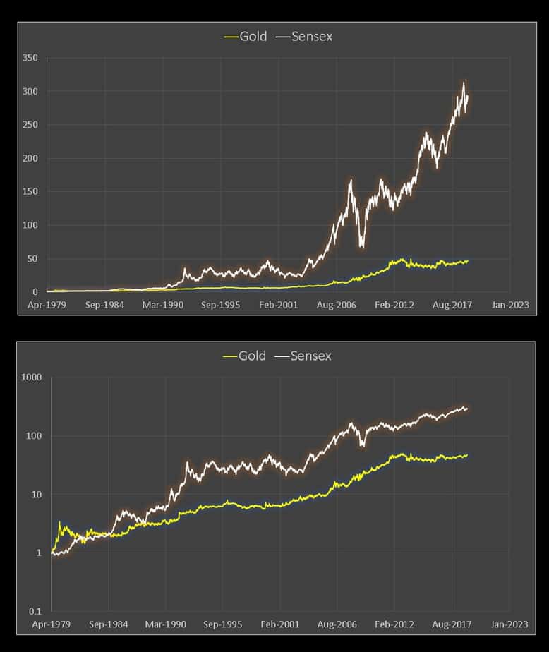
Gold vs Equity Price movement
🔥Secure your future with our Robo-advisory tool trusted by over 3,500 investors and advisors. From effortless retirement planning to funding your children’s biggest dreams, turn your financial goals into reality. 🔥
Subscribe for money management solutions via email! (Link takes you to our email sign-up form) Join 32,000+ readers in our community.
👉 New Tool Alert! NaviPlan: A Privacy-Focused Multi-asset Tracker and Goal Planner 👈
The bottom panel uses the log scale. Just like equity, gold too is prone to extended sideway markets.
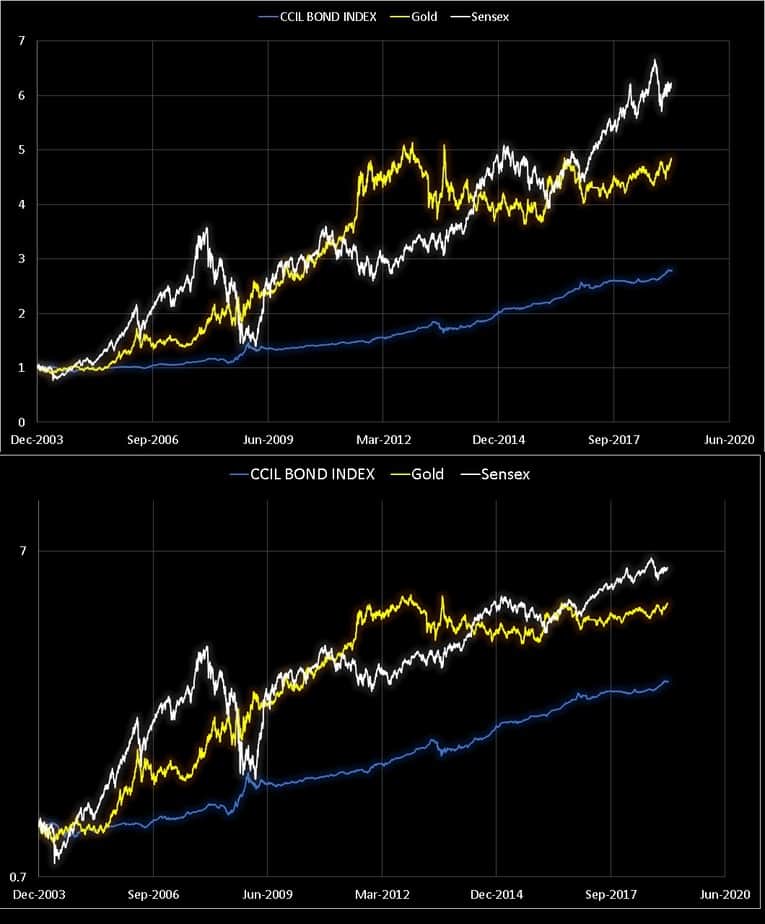
Gold vs Equity vs Bonds price movement
I use the CCIL Bond Index as a proxy for market linked fixed income and the data below is from Jan 2004. The bottom panel uses the log scale.
Gold vs Equity: risk vs reward charts
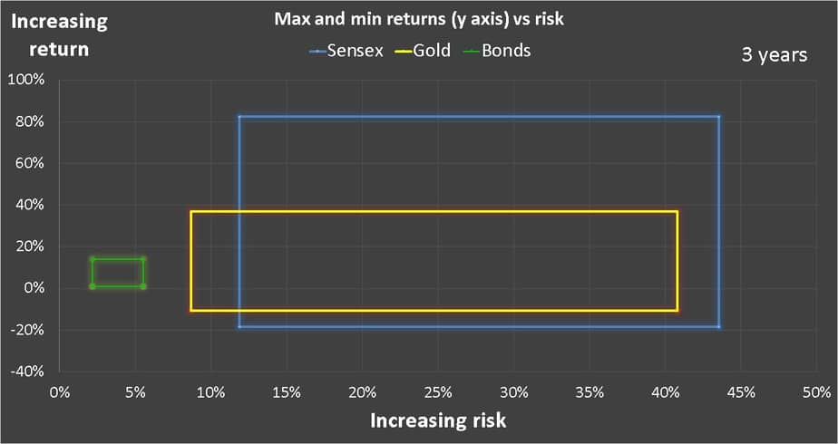
3 years
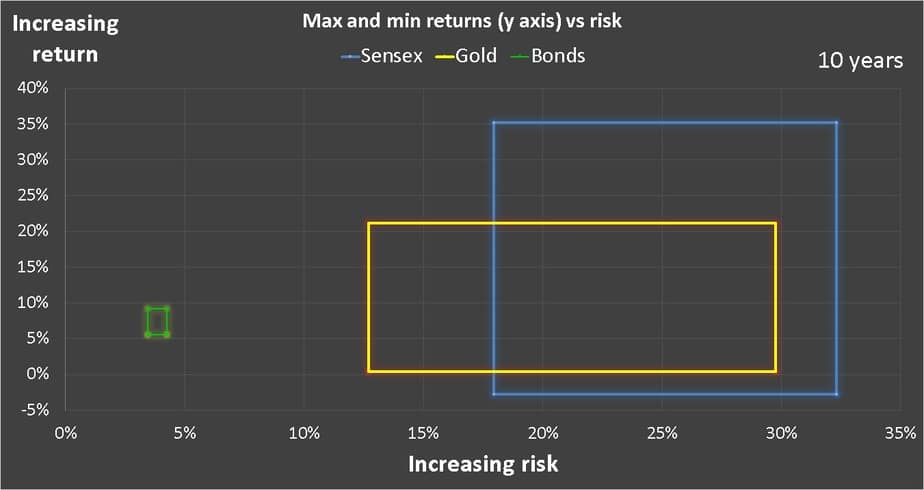
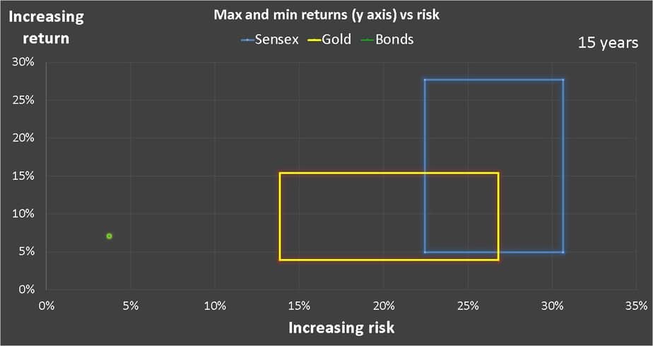
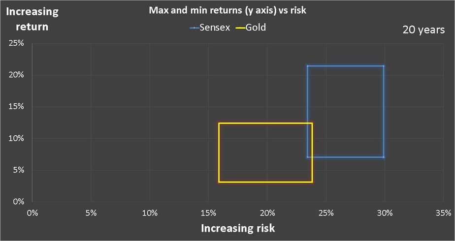
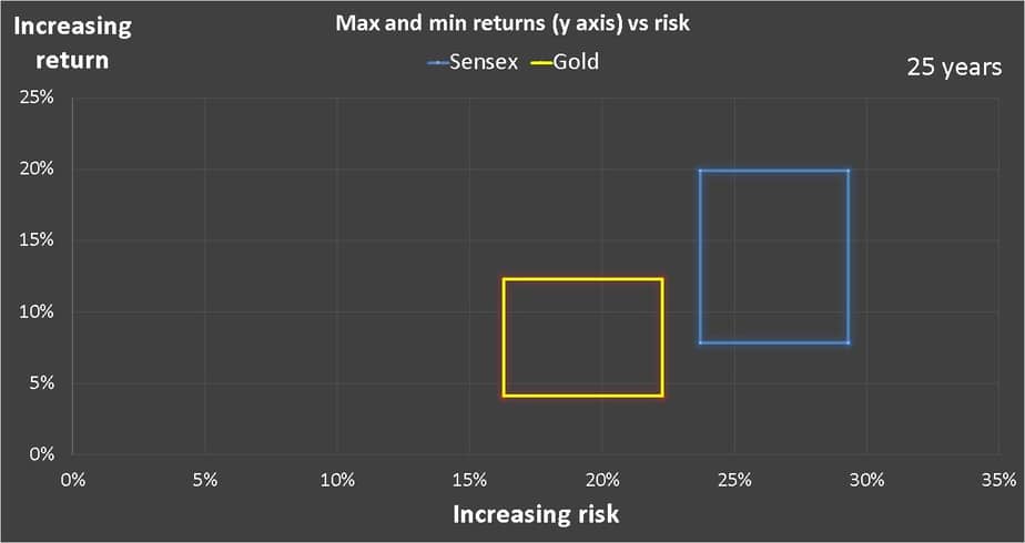
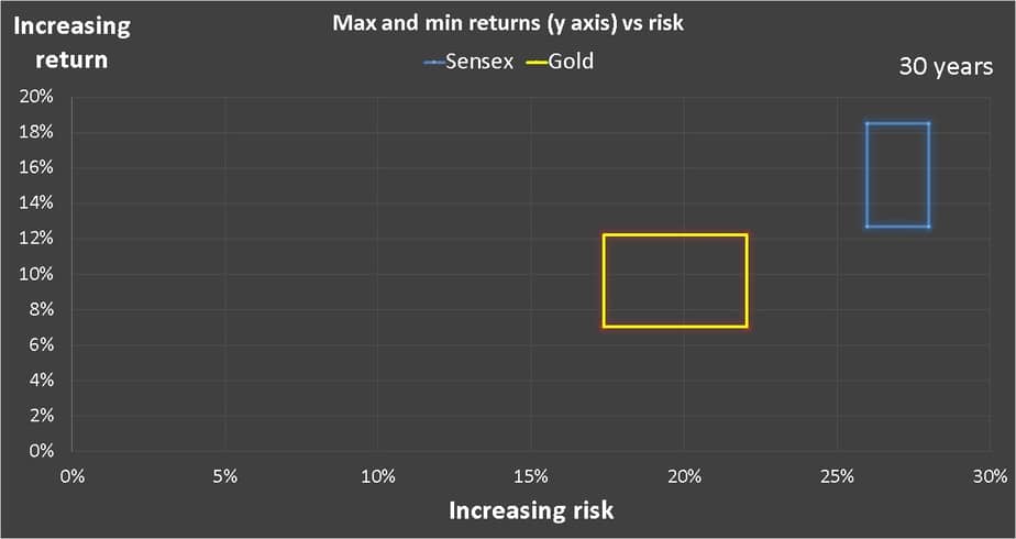
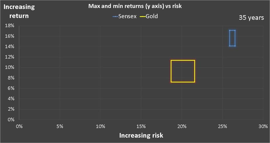
The horizontal axis is the volatility or risk as measured by the standard deviation. The vertical axis the return. The max risk, min risk, max return and min return for each asset class is plotted. So for gold these four data points represent the four corners of the yellow rectangle. So all points of risk and reward observed over every possible 3 year period from Jan 1979 to Jan 2019 fall within this rectangle. The same is true for Sensex (blue rectangle). I have also used the NAV for CCIL BOND INDEX from Jan 2004 as a representative of market linked fixed income.
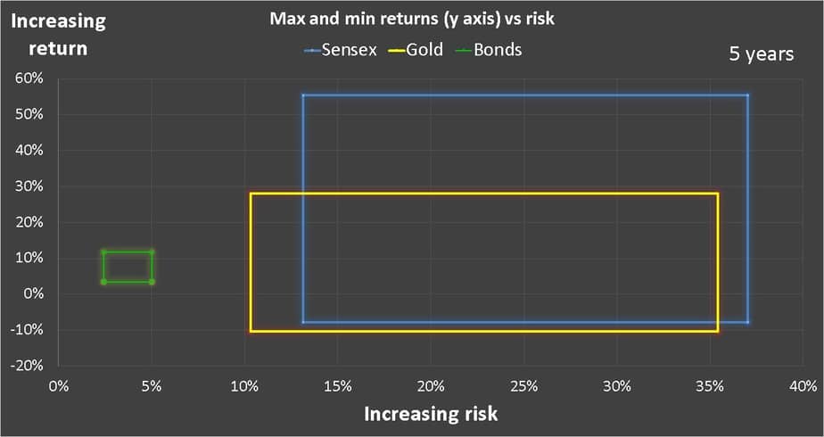
Now, observe the size and movement of the rectangles as the duration is increased.
5 years
10 years
15 years
20 years
25 years
30 years
35 years
Observations
Notice that that size of the gold rectangle is pretty big and is only just below the equity rectangle. Meaning that gold investing has a significant risk. However, return wise, the gold rectangle is always below the equity rectangle. Meaning, its reward (return) is typically lower. Comparable risk but not comparable returns means, high risk and low returns. A terrible no, no.
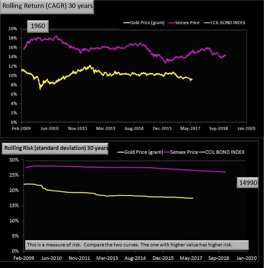
The sudden decrease in box size when we go from 25 to 30 to 35 a year is because of a decrease in the number of data points. See charts below. This is artificial and should not be mis-interpreted.
Gold vs Equity Rolling Return Charts
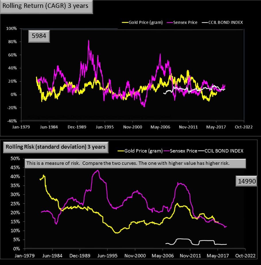
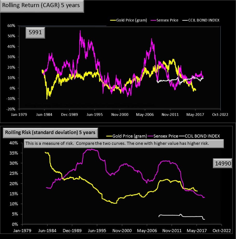
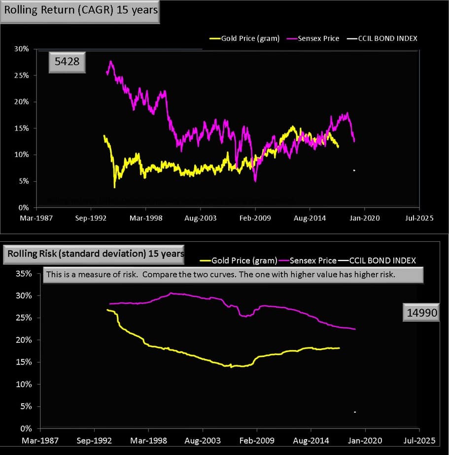
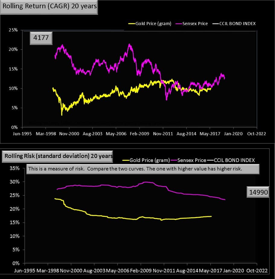
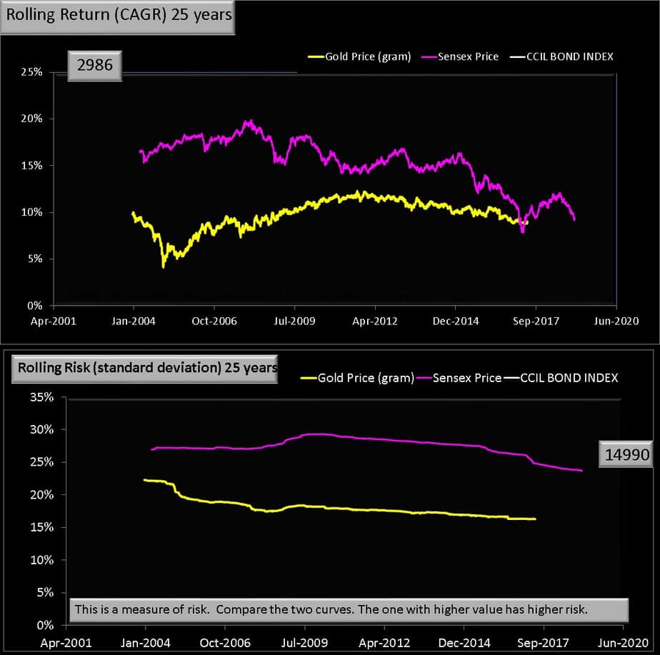
Now I present the rolling return charts from which the above graphs were calculated. Please take a moment to appreciate how wild equity and gold returns can swing. That is, observe the max and min returns of both gold and equity as the rolling return increases.
3 years
5 years
10 years

15 years
20 years
25 years
30 years
35 years
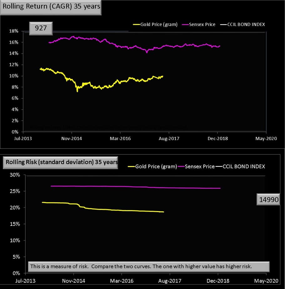
Observations
Even after 3 decades, gold swings from 7% to 12%, while equity (even with dividends excluded) has double digit returns (although this does mean it will recur in future). The risk however is still comparable. Gold risk is closer to equity risk than bond risk. Again this means, gold investing is unproductive if your idea is to buy and hold. The reward is not commensurate to the risk taken.
Video Version
So how should one invest in gold? I
As shown in this study – Should gold be part of your long-term investment portfolio – there is no need for gold in the portfolio. That is as an investment where we only track the price and expect a return from it.. It is possible to track the price free of risk for a future gold purchase as discussed in the video below.
If want to have gold in your portfolio, then an exposure of at least 10-20% is essential to make a difference. This will have to rebalanced once a year and one should be ready for the tax out go. A less riskly and perhaps more productive way is to adopt trend following approach using moving averages
Read more: When to invest in gold and when to buy it