Last Updated on December 29, 2021 at 11:54 am
Can we spot market highs and lows using technical indicators? The answer is yes, provided a user understands the pros and cons of each method. I discuss the current state of a few technical indicators and discuss their benefits and limitations. This post is in-part triggered by comments from Dhinesh Kumar here: Timing the market by spotting bullish and bearish trends
Before we begin, if you have missed the last couple of posts, you can catch up right now.
- How should we invest in the present market condition?
- Use this “market crash” to clean up your equity fund portfolio tax free!
- 10 things mutual fund investors should not be doing!
There are several technical indicators available for trading. Smart traders combine many indicators to minimize their losses. Smart traders also understand that in real-time making decisions is far tougher than looking at a chart in hindsight and that things can go wrong.
The problem is that many people who talk about technical analysis act and talk like they know the knows of nature and markets. They sound so sure of themselves, that it is repulsive. It is a blind marriage to the indicators. The situation is similar to many who have a “guruji”. If a cup falls off a table and is not broken because it fell on their feet first, many would claim, “the grace of guruji saved the cup from breaking”. Such is the blind faith and acceptance of technical indicators.
🔥Secure your future with our Robo-advisory tool trusted by over 3,500 investors and advisors. From effortless retirement planning to funding your children’s biggest dreams, turn your financial goals into reality. 🔥
Subscribe for money management solutions via email! (Link takes you to our email sign-up form) Join 32,000+ readers in our community.
👉 New Tool Alert! NaviPlan: A Privacy-Focused Multi-asset Tracker and Goal Planner 👈
I am not saying such indicators do not work, they do, but like everything in life, if you want some the good, you have to live with the bad. The problem is many sound as if there is no bad and the indicators will work “for sure”. The other extreme is the so-called investors (especially those who call themselves value investors) who blindly dismiss technical indicators as nonsense.
What follows is an open-minded approach to the topic. The problem is never with any formula or indicator. The problem is with the humans who use it or rather who fail to use it right. Human emotions and inflexibility cloud the true efficacy of these indicators. That is enough, let us get on with it
The 10-year moving average of the Nifty 50 PE
Readers can plot this and much more with the sheet in Nifty Valuation Analysis with PE, PB, Div Yield, ROE, EPS of 21 NSE Indices. If there is enough interest, I can extend this sheet to include the other indicators discussed today.
The PE ratio is the current price divided by the earnings per share of the index. If the PE is “too high” then the market is paying too high a price for the earnings and must “correct” down (I hate that word now!). If the PE is “too low” then the market is paying too low a price and must correct up.
Have a look at the 10-year moving average (avg) of the Nifty 50 PE (the centre line below). The standard deviation (stdev) tells you how much each Nifty PE value deviates from the average. The two lines above the central average line represent:
- avg + stdev
- avg + 2*stdev
Similarly, the two lines below the central average line represent:
- avg – stdev
- avg – 2*stdev
Now, this imo is the weakest indicator for two reasons. We do not have much data and the average keeps moving with each passing day. The second graph below shows an expanded view on the recent trend.
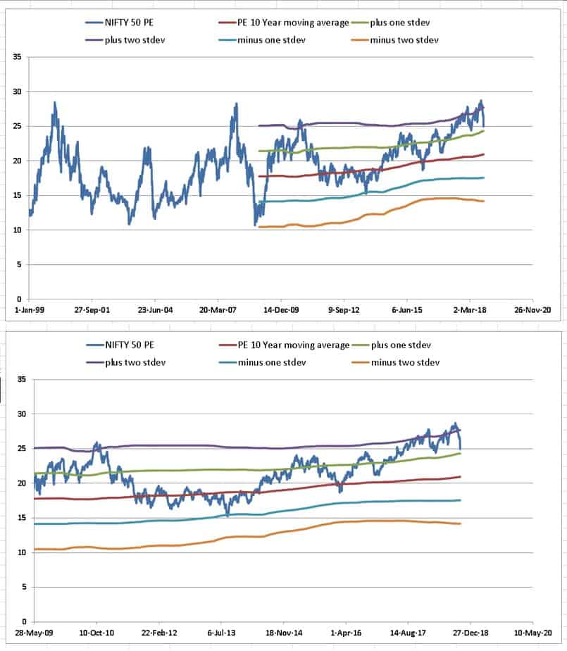
It is tempting to assume that if the Nifty PE hits the avg + 2*stdev line, it is time to quit equity. However, as you can see, it can move down and move back up quickly. If you go by this indicator, you will have to pull out of equity and stay out for months and months (even ~ 2Y) as seen in Market Timing with Index PE Ratio: Tactical Asset Allocation Backtest Part 1 (this uses high and low values and not moving averages)
IMO, this is neither practical nor reliable as what we call as a high PE is simply too dependent on time: What is a high index PE?. At best it can be used for getting backing into the market, say when Nifty PE is below the moving average (again only a crude indication).
The 10-year moving average of the Nifty 50 PB
Arguments made above can also be used to gauge valuation using the price to book value. The book value or shareholders is a measure of asset assets – liabilities. So it is a bit like the NAV of a ETF and the current market price the price of the ETF.
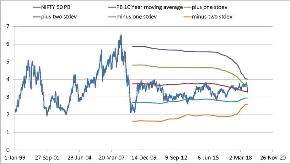
If we go by the above chart, high valuations could correspond to current PB > the 10Y PB average but notice how sharply the average falls. So I don’t think it is that reliable. Also, read: Is PB-based investing better than PE-based investing?
Simple moving average crossovers
I recently discussed this method here: Timing the market by spotting bullish and bearish trends. The idea is to smoothen the daily market movement using an average. For example, on the 365th day, you take the average of the last 365 closing prices), do the same next day and the next and so on.
If you use a single moving average, then when the market price dips below the moving average it is a sell-signal and vice versa. A more reliable method is to use two moving averages and look for crossovers.
You can use 12-month and 6-month, 10-month and 5-month etc. Results will not differ much. Do not spend time backtesting to find out the perfect combination and call it guruji. That is silly.
You can see one such moving average pair below. When the short-term average falls below the long-term average, it is time to quit. When the short-term average moves above the long-term average it is time to re-enter.
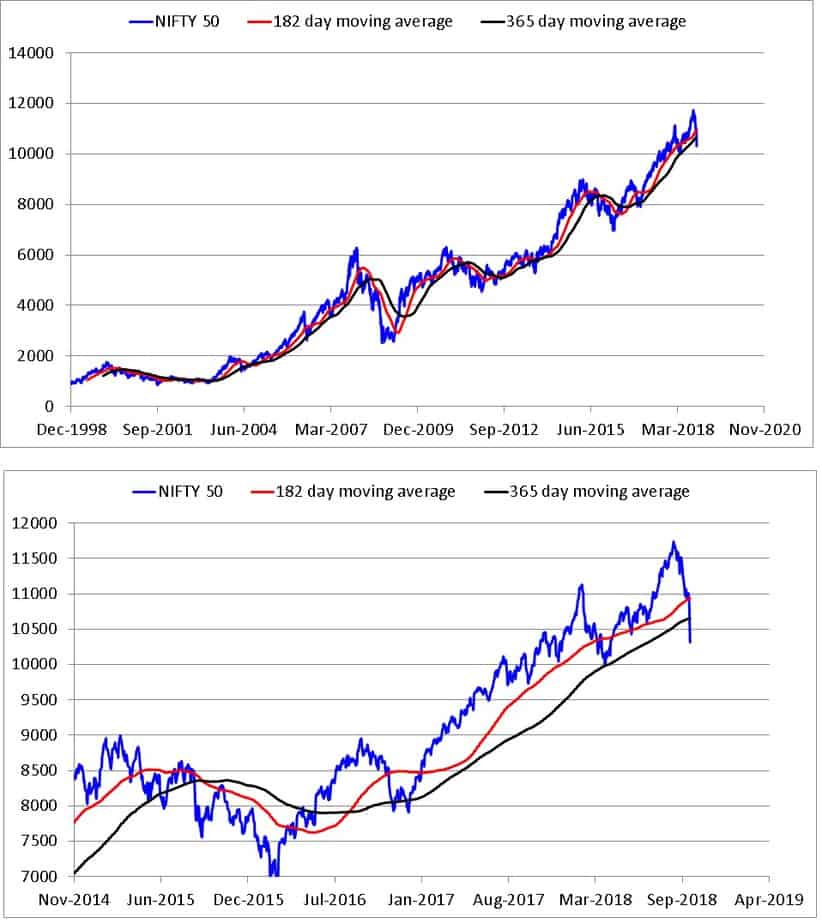
If you take this seriously, then it is not yet time to exit. The trouble with this indicator is that it generates buy and sells signal well after the fall or rise event. Also, there can be crossovers in quick succession resulting in moving in and out too much.
The question we shall consider for the rest of the post is, it is possible to spot market highs and lows a bit earlier than this method.
Exponential moving average crossovers
The standard alternative to the simple moving average (SMA)is the exponential moving average. (EMA) This offers higher weight to recent price movement and responds faster than the simple moving average as seen below. The weight to older data decreases exponentially and hence responds faster. The EMA peak is closer to the market peak than the SMA peak, but there is not much different in the case of the troughs.
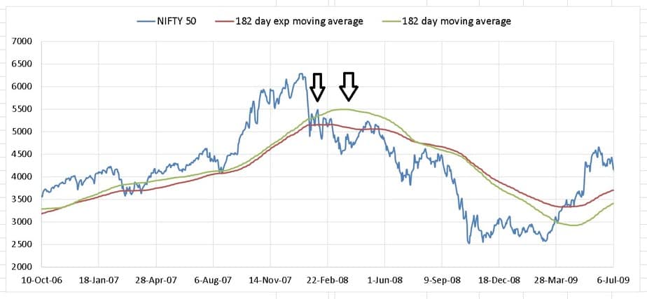
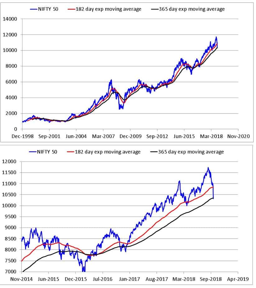
The difference between SMA and EMA is not significant for such long-term indicators. This is because the weight offered to recent price data is quite less for such long-term EMAs.
Moving Average Convergence Divergence (MACD)
A potentially more sensitive method is to compute the difference between the two EMAs above and then take the moving average of the difference. The MACD seen below is the difference between the 180-day EMA and 365-day EMA. The average of this difference is known as the MACD signal or simply the signal. I have used a 136-day average. Since these are long-term indicators, the usual trading rules will not apply as-is.

Sell signal: When the MACD goes below its signal.
Buy signal: When the MACD goes above its signal.
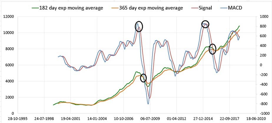
Notice the current levels of the MACD/signal and recognise that it hard to make calls in real time and very easy to do so while looking at the past. It will take a good amount of courage, conviction and discipline to follow these technical indicators if you are open-minded about them. Perhaps that is why many people use the guruji technique. If we get rid of reason, we can cheer if our guruji says E is not mc^2 and that there is a software to make animals talk.
Relative Strength Index (RSI)
The simplest definition of the RSI is that it represents recent average gains divided by average losses. If the avg gains are higher than the index is overbought. If the avg losses are higher, the index is oversold. The problem with the RSI is similar to that of the PE or PB ratios. It is based on arbitrary high or low numbers. I have plotted the 365-day RSI for the Nifty below.
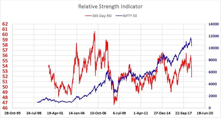
It is pretty hard to use the RSI for getting out of the market. However, like the PE, a low RSI say 50-ish or lower seems like an indication to buy.
Summary
Each technical indicator has flaws so the only option is to combine them so that we use their best features for buying/selling. For example, the MACD sell signal can be used for exit and low RSI for entry. However, this is easier said than done in real-time. Technical indicator bhakts often refuse to recognise this.
Give this sheet a try: Nifty Valuation Analysis with PE, PB, Div Yield, ROE, EPS of 21 NSE Indices. If there is enough interest, I can extend this sheet to include EMA, MACD and RSI.
Missed the last couple of posts? You can catch up right now.
- How should we invest in the present market condition?
- Use this “market crash” to clean up your equity fund portfolio tax free!
- 10 things mutual fund investors should not be doing!