Last Updated on August 22, 2022 at 11:17 pm
When the personal financial audit 2017 was published, I had discussed how my equity retirement portfolio has grown with time and also mentioned that a tool with which you can do the same is on the works. It is now nearly complete. In this post, I use the tool and compare my equity mutual fund portfolio (retirement) with the Sensex, NIfty Next 50 and analyze how stressful the journey was. You can do the same too 🙂
In the post on Index Investing: advantages and disadvantages of being a passive investor I had talked about the importance of lowering risk in real time – which active funds do one way or another – then using a volatile fund such as the Nifty Next 50. My portfolio highlights this aspect again. Of course, many readers do not agree as they bent on one thing – “finally” if the index outperforms, it is not a good idea to index invest?
All I can say in response is, ‘good luck and godspeed’. I prefer to a portfolio that falls lower than the index because I do not think that the “market will eventually get back up” – not when I need the money. As R Balakrishnan put it so eloquently:
equity will give you returns, but not when you need it
Therefore I recognise the importance of lowering risk in real-time. There is more to investing than returns and costs. So now on to the graphs.
🔥Secure your future with our Robo-advisory tool trusted by over 3,500 investors and advisors. From effortless retirement planning to funding your children’s biggest dreams, turn your financial goals into reality. 🔥
Subscribe for money management solutions via email! (Link takes you to our email sign-up form) Join 32,000+ readers in our community.
👉 New Tool Alert! NaviPlan: A Privacy-Focused Multi-asset Tracker and Goal Planner 👈
Update: The tool used to create the graphs for this post is now available. Scroll down for download link.
Since inception portfolio vs Sensex
With the tool, you can simulate index comparisons. That is, choose an index and make the same transactions as you have done in your portfolio with it. If you buy Rs. 1000 on Jan 2nd 2011 in HDFC Top 200, you do the same with Sensex or Nifty Next 50. If you redeem, you redeem from the index too. So here is how my portfolio compares with Sensex
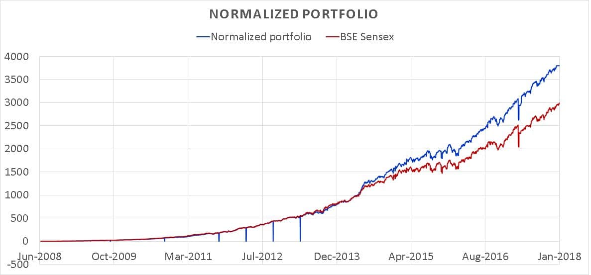
So should I be happy? No, I should be comparing my portfolio with Nifty Next 50: The Benchmark Index That No Mutual Fund Would Touch?!
Since inception portfolio vs NIfty Next 50
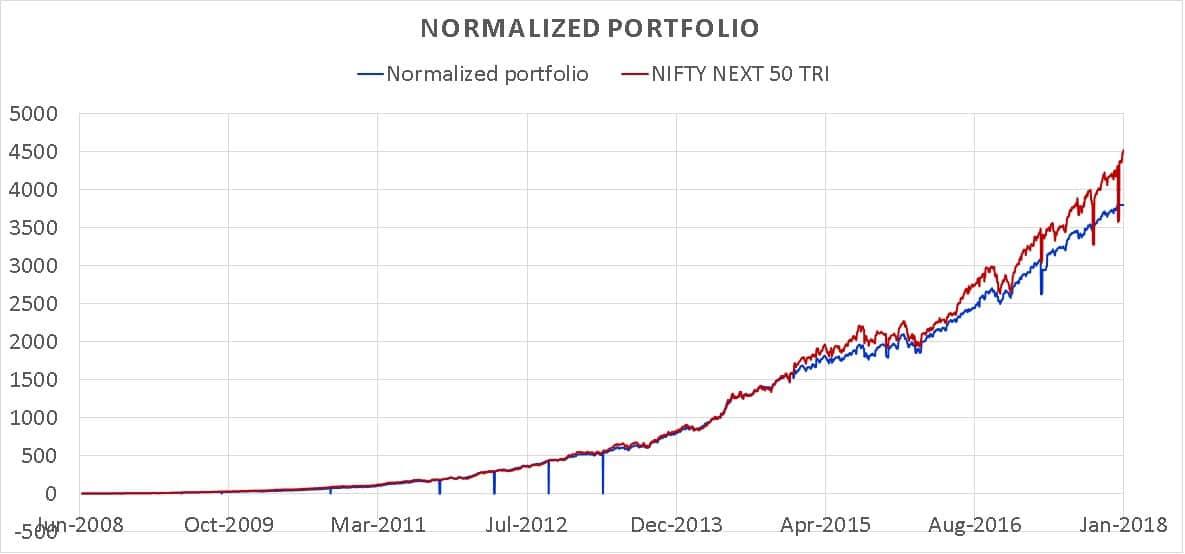
Waaa! I am such a poor investor. If I made the purchase and redemptions (exact amounts, exact dates) on the NIfty Next 50, it would have given me better returns
Not so fast.
A few years ago, I had discussed Mutual Fund Analysis With the Ulcer Index. Before it was clear that ulcers were caused by a bacterium, stress was believed to the cause of ulcers. So the Ulcer index is a measure of investor stress.
The Ulcer index is designed in such a way that it penalizes downside (fall from the maximum) much more than other ratios. It was first published by Peter Martin and Byron McCann in their book The Investors Guide to Fidelity Funds (1989). Peter Martin describes the index in his page: tangotools. The out of print book in pdf form can be found here.
Higher the ulcer index, lower the downside protection and higher the investor stress.
You can use the freefincal Mutual Fund Risk vs Return analyzer to calculate the Ulcer index of any fund with its benchmark. Here will compare the ulcer index of my portfolio with that of an investment in the NIfty Next 50.
Please note that the ulcer index and portfolio rolling return analysis are not (yet) part of the portfolio analysis tool. You can however use it compare your portfolio with a variety of indices.
Ulcer Index of portfolio vs NIfty Next 50: 8 years
The blue line is the ulcer index of the portfolio (left axis). The burgundy line is the ulcer index of NIfty Next 50 (left axis). The light green is the normalized portfolio value (right axis). The violet is the normalized Nifty Next 50 investment value (right axis).
Take a few seconds to understand this graphs as similars one will follow below.
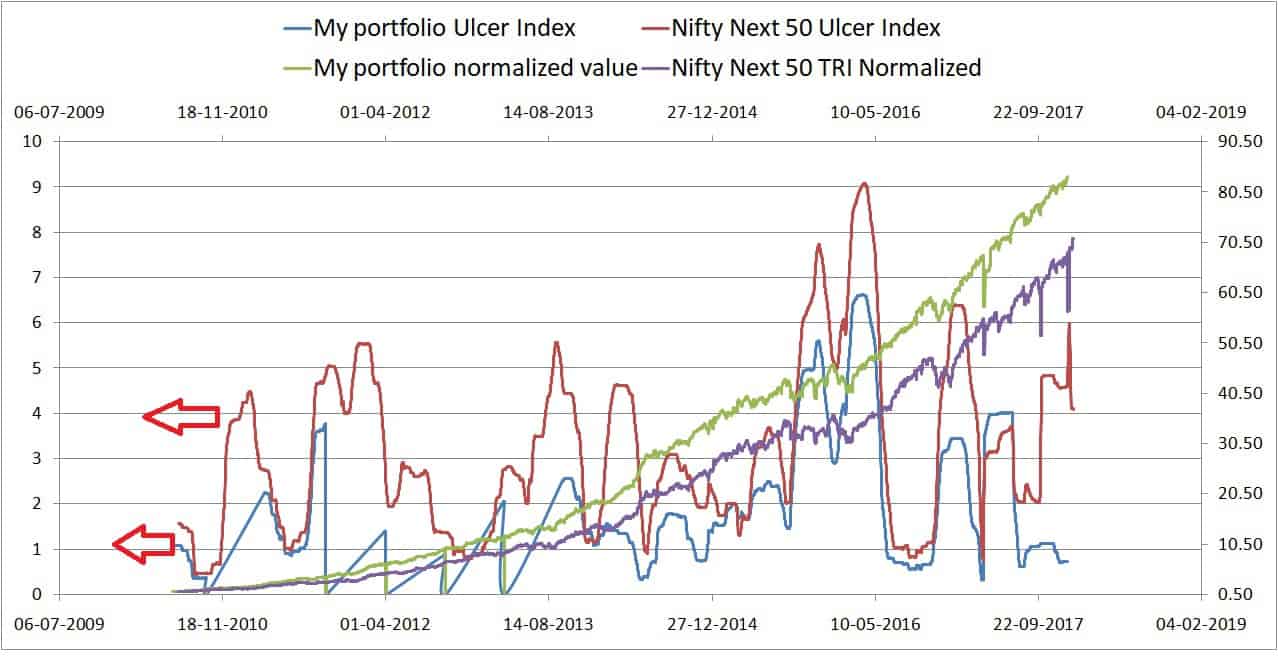
The ulcer index of my portfolio is pretty much lower than that of NN50. So I was less stressed holding it. To me that is valuable. If you don’t care about it and assume in the end you will always get higher returns from the index, all I can is good luck.
Why is the portfolio outperforming the index now? Because results depend upon the interval chosen. It is like blind men touching the elephant.
Now you are going to see the same graph as above for different durations. The conclusions are the same.
Ulcer Index of portfolio vs NIfty Next 50: 7 years

Ulcer Index of portfolio vs NIfty Next 50: 6 years
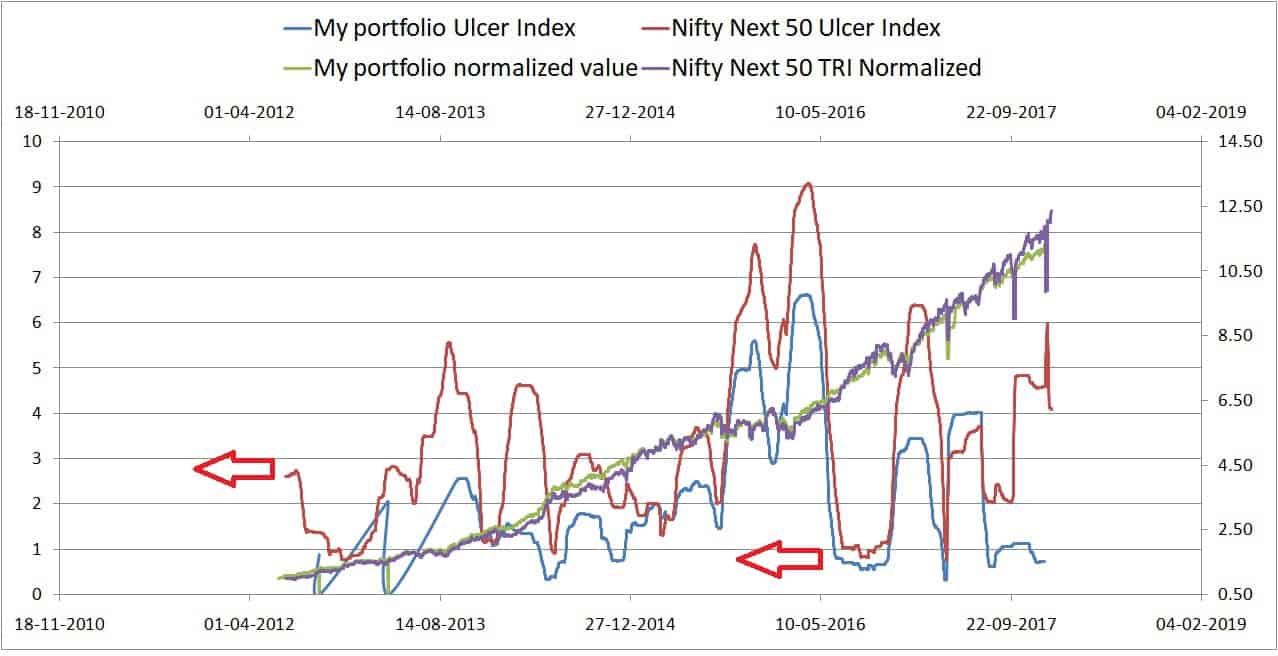
Ulcer Index of portfolio vs NIfty Next 50: 5 years
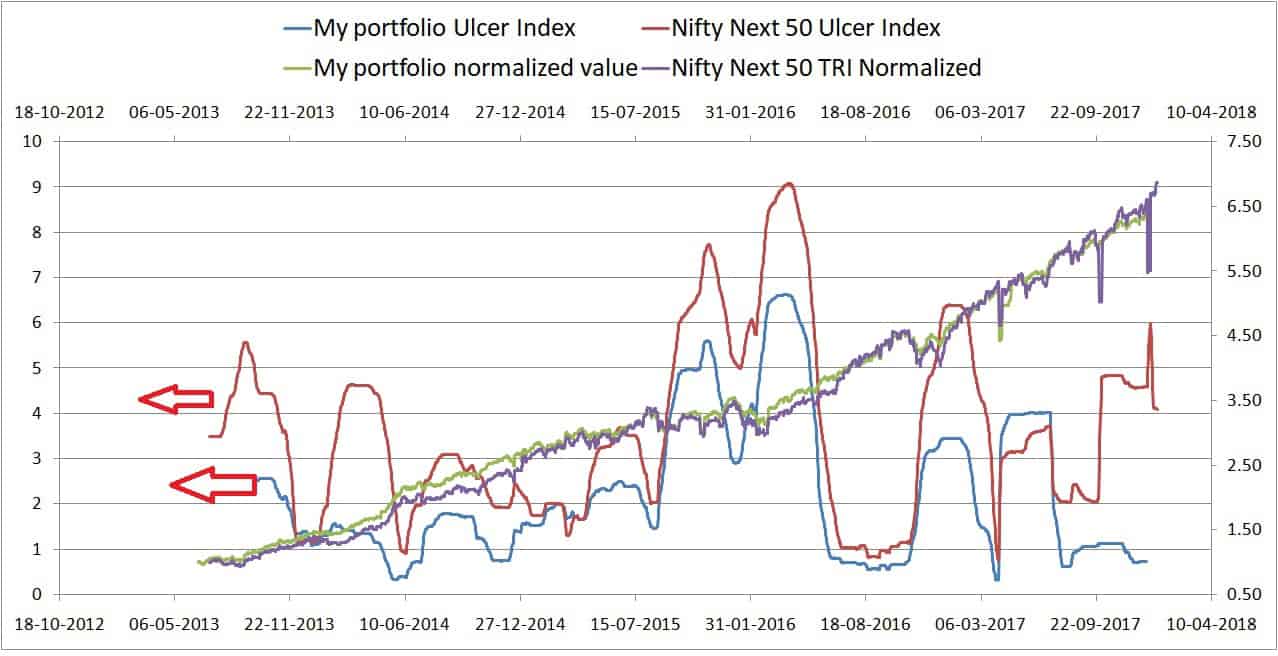
Ulcer Index of portfolio vs NIfty Next 50: 4 years
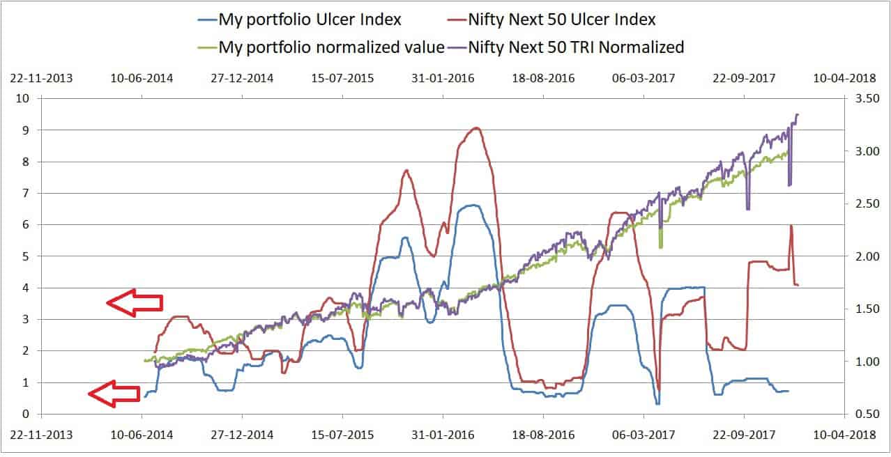
Ulcer Index of portfolio vs NIfty Next 50: 3 years
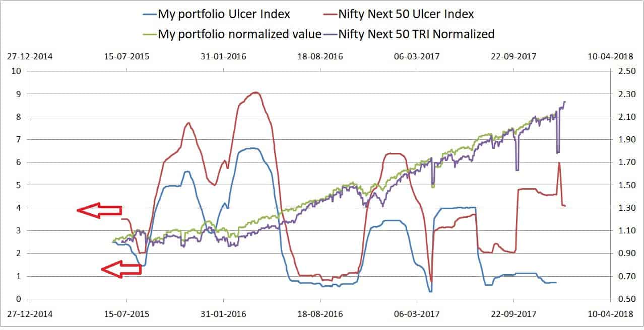
Ulcer Index of portfolio vs NIfty Next 50: 2 years
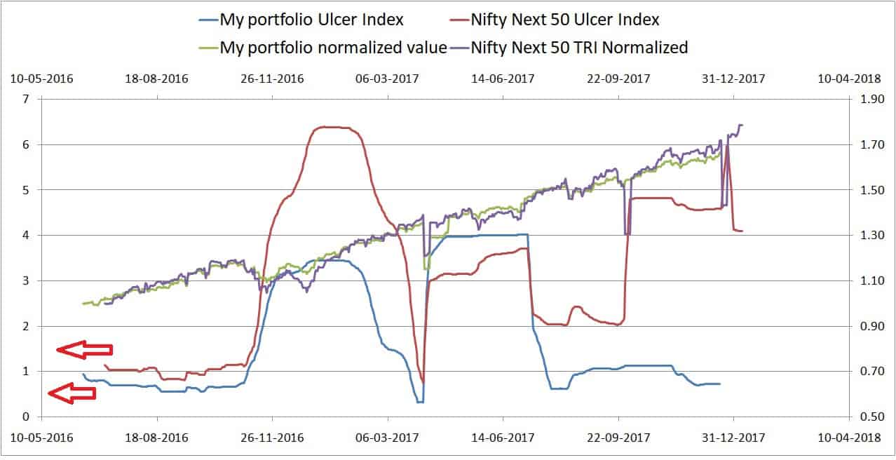
Rolling return portfolio analysis vs Nifty Next 50
In the nearly 10 years that I have been investing in equity, there are 1648 5-year periods. These are plotted below for the portfolio and NN50.

So the portfolio has “only” beat the index by 51%. That is for those who assume “beating” the index only means “more returns”.
Downside protection of the portfolio vs NN50
Comparing the monthly returns over 5Y periods, we can calculate the downside protection of the portfolio. If it is less than 100%, then the portfolio has been better than the index in containing losses. If it is more than 100%, then the portfolio has lost more than the index.
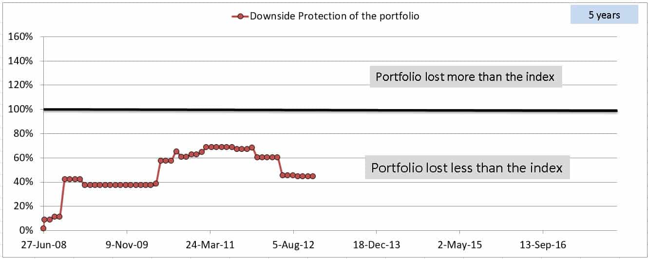
Excuse me for thinking that the cost of active management has been quite worth it.
A sneak peek into the portfolio visualization
This is the main input screen of the tool. If things go to plan, I shall release it on Thursday. Still, a couple of things to be ironed out.
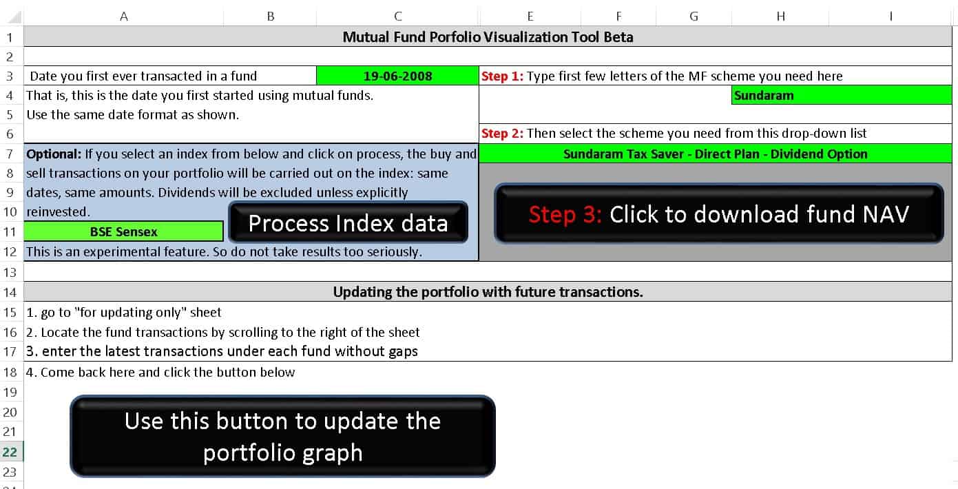
I would like to include stocks into this tool depending on your feedback.
Download: Mutual Fund Portfolio Growth Visualizer With Index Benchmarking